Before anyone reads your bio, they have already decided whether to click. That decision is made on a handful of images, seen small, next to other studios. You cannot control who is browsing, but you can control what they see first, and that is almost entirely a question of which photo goes where.
This chapter covers the two sets of images on your page: your studio photos and your work photos. What to shoot, what to upload first, how to crop, and how to spend the eight free slots.
1. Where your photos actually appear
Your images show up in three places, and each one asks something different of them.
- Your card on the browse page. A small landscape image with your portrait in the corner. Collectors can click through a few images on the card, but most will not. The first image does the work. On the card, that first image comes from your studio photos.
- Inside my art studio. The studio photos on your page itself. This is where someone decides whether the place is worth a visit.
- My work. Your artwork photos. This is where someone decides whether they want to own something.
Research on websites found that people form a stable judgment about visual appeal in about 50 milliseconds, before they have read a word (Lindgaard and colleagues, 2006). A browse page works the same way. Your first studio photo is not decoration. It is your first impression.
2. Your first studio photo: the one that decides the click
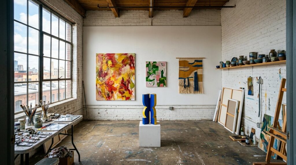
Pick the photo that shows the room and the work in the same frame. Not your desk, not a detail of brushes, not the view out of the window. A collector scrolling through studios is asking one question: what would I see if I went there?
- Landscape, not portrait. The card is wide. A tall photo gets cropped top and bottom, and usually the crop removes exactly what you wanted to show.
- Shoot from the doorway or a corner. Standing back shows depth. A room that reads as a real space invites people in.
- Work on the wall, in focus. At least a few pieces should be clearly visible, even at thumbnail size.
- Daylight, lights on. Take it when the room gets its best light, with any lamps you normally use switched on. Dark studio photos look smaller and colder than the room is.
- Keep the mess that belongs. Paint on the floor and work in progress are fine. Laundry, recycling and a laptop screen are not.
3. The rest of your studio photos
After the opener, add two or three more that answer the questions a visitor has before they come:
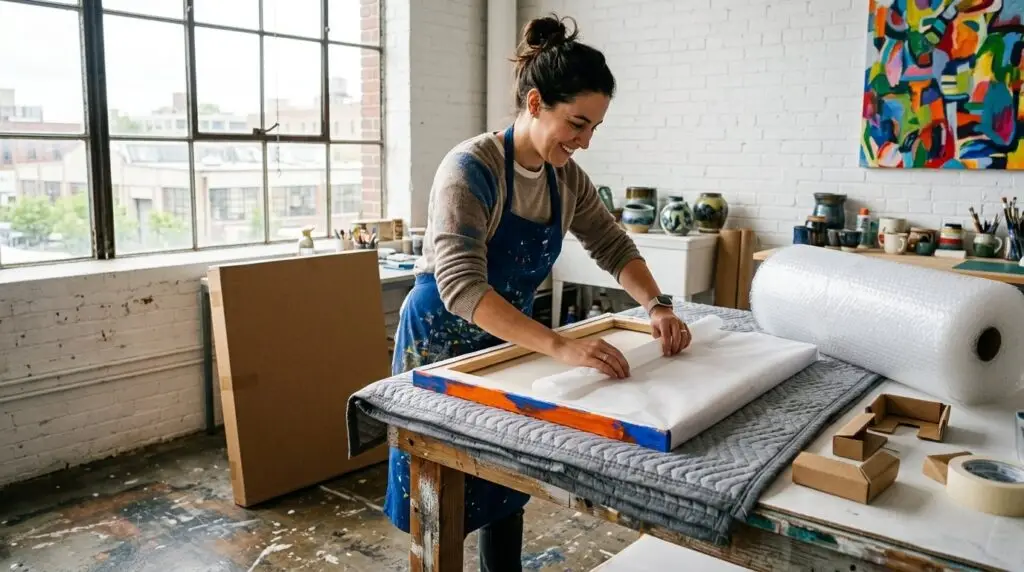
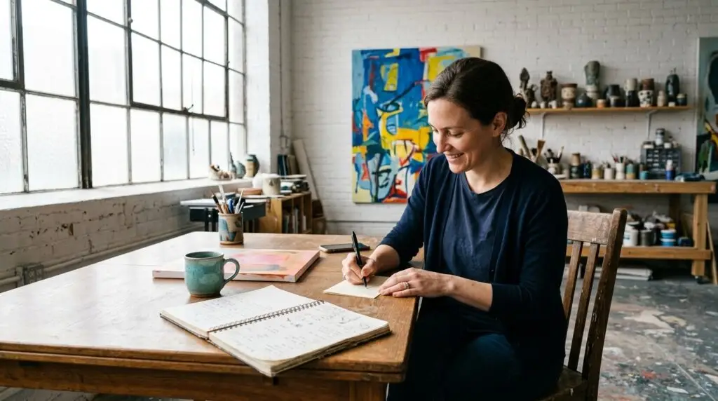
- You at work. Not posed, not looking at the camera. Hands in the material is enough.
- A closer view of work in progress. This is the part nobody gets to see in a gallery.
- The way in, if it helps. A photo of the building entrance saves a lot of confused messages later.
4. Your work photos: order is the argument
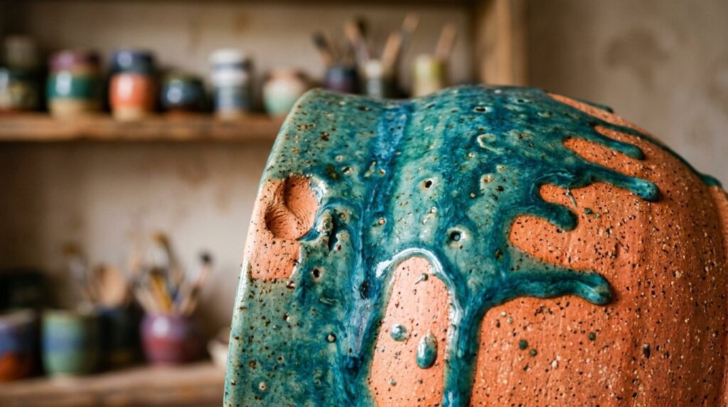
The first work photo carries the most weight, so put your strongest, most representative piece first. Not your newest, not your favorite, not the one that took longest. The one that best says: this is what I make.
Then order the rest so they read as a body of work:
- Your strongest piece first.
- Two or three works from the same series, so a visitor sees that the first one was not a one off.
- One installation view: a work on the wall, with something next to it for scale, like a chair or a door frame.
- One detail shot, close enough to see the surface, the brushwork, the glaze or the weave.
- Then range: different sizes and, if you have them, lower price points.
People value original work partly because it came from the artist’s own hand. In experiments at Yale, participants rated a sculpture higher when they were told the artist made it by hand rather than with machines (Newman and Bloom, 2012). A detail shot is how you show that on a screen.
5. How to use the eight free slots
A free page shows up to eight works. That is a curation problem, not a shortage. Eight well chosen photos beat twenty mixed ones.
- Upload only work that is available, or that clearly represents what is available.
- Stick to one or two bodies of work. If you work in very different ways, pick the one you most want to sell right now.
- Use one slot for the installation view and one for a detail. They sell the other six.
- If you sell a piece, replace it. A page full of sold work sends collectors away with nothing to ask about.
On the Studio Plan the limit goes up. If you move back to free, works above eight are set to unpublished, not deleted, so there is no risk in adding more while you can.
6. Shooting and cropping your work
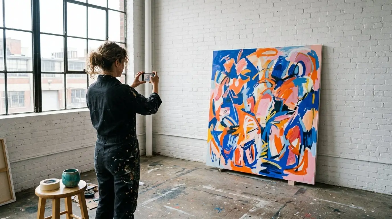
- Shoot square on. Stand directly in front of the center of the work, camera level, so the edges are straight. Tilted edges make a painting look like a snapshot.
- Soft, even daylight. Indirect light from a window, no direct sun on the surface, no flash. Turn off warm lamps that shift the color.
- Crop to the edge of the work. For the main image of each piece, crop right to the edge, with no wall, floor or fingers in frame. Save context for the installation view.
- Check the color. Hold your phone next to the work and compare. If the red on screen is not the red on the canvas, fix it before uploading. Color is the first thing a buyer complains about.
7. File size and format
Big enough to look sharp on a large screen, small enough to load quickly on a phone.
- JPG for photos.
- Around 2000 pixels on the long side is plenty. Straight off a modern phone is often three times that and slows your page down.
- Name the file after the work before uploading, for example blue-harbor-oil-on-linen.jpg instead of IMG_4471.jpg. It costs nothing and helps search engines understand the image.
The short version
- Your first studio photo is your card on the browse page: wide, from the doorway, work visible, good light
- Add two or three studio photos: you at work, work in progress, the entrance
- Strongest work first, then a series, an installation view, a detail, then range
- Eight free slots is a curation job, not a limit to fight
- Shoot square on in soft daylight and crop to the edge
- About 2000 pixels on the long side, named after the work
Sources
- Lindgaard, G., Fernandes, G., Dudek, C., and Brown, J. (2006). Attention web designers: You have 50 milliseconds to make a good first impression! Behaviour and Information Technology, 25(2), 115 to 126.
- Newman, G. E., and Bloom, P. (2012). Art and authenticity: The importance of originals in judgments of value. Journal of Experimental Psychology: General, 141(3), 558 to 569.